Center Chest vs Left Chest vs Full Front: Choosing a Shirt Print Placement
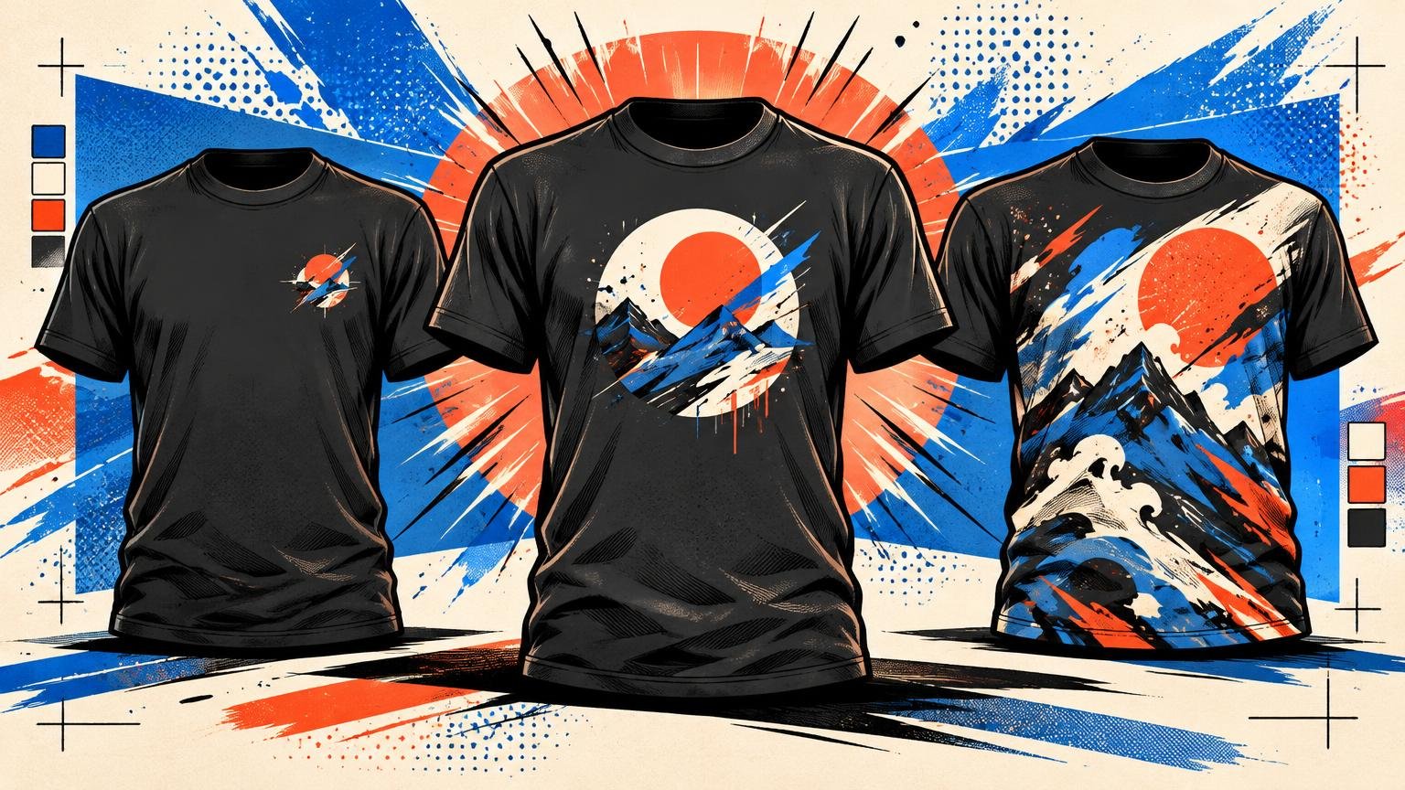
Choose left chest when the graphic should act like a signature, center chest when it needs to become the clear focal point, and full front when the artwork needs room to build a complete visual world. The right choice is not simply the largest area your printer offers. It is the placement that gives the image the correct role on a moving body.
That distinction matters because a shirt is not a poster with sleeves. Fabric folds, the wearer turns, and different garment sizes change the apparent scale of a fixed-width print. Placement must support the artwork’s hierarchy while leaving enough blank fabric for the design to breathe.
The three placements at a glance
| Placement | Typical printed size | Best visual role | Watch for |
|---|---|---|---|
| Left chest | About 2.5–5 inches square | Quiet identifier or accent | Tiny type and details losing clarity |
| Center chest | Roughly 6 × 6 to 10 × 8 inches | Focused statement graphic | Obvious off-center alignment |
| Full front | Up to roughly 12 × 16 inches on many standard tees | Dominant illustration or composition | Crowding the collar, seams or body |
These figures are starting points, not universal templates. Available print area changes with the blank, garment size, cut, supplier and decoration method. Product-specific templates should control the final file. The SanMar decoration-location reference also treats left chest and full chest as distinct zones, reinforcing that these placements are different compositional decisions rather than interchangeable coordinates.
Use left chest for restraint and identity
A left-chest graphic works best when it can be understood almost instantly: a symbol, monogram, compact badge, short wordmark or tiny illustration with a strong silhouette. It does not need to dominate the shirt. Its job is to reward a closer look and give the garment an identifiable point of character.
The usual working area is approximately 2.5–5 inches square, with guidance commonly placing it around 3 inches below the neckline and about 2 inches from the armpit. Those measurements still need adjustment for the exact shirt. A narrow fitted tee and a broad heavyweight blank do not present the same chest geometry.
The weakness of left chest is also its appeal: it is small. Dense lettering, delicate line work and miniature scenes can become visual grit. If shrinking the art forces you to explain what it depicts, the design is probably fighting the placement. Simplify it or give it more territory.
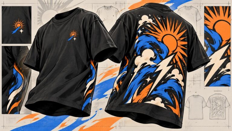
Left chest is especially effective when paired with a larger rear composition because the two locations can perform different jobs. The front introduces; the back delivers. Our guide to combining a small front graphic with a back print explains how to connect those two elements without merely repeating the same artwork at different sizes.
Choose center chest for a clear focal point
Center chest is the most versatile answer for a graphic that should be noticed without taking over the entire torso. Medium logos, short slogans, single illustrations and compact image-and-type arrangements tend to fit naturally in this zone. A common example is around 8 × 8 inches, within a broader range of roughly 6 × 6 to 10 × 8 inches. Placement guidance generally starts the graphic about 3–3.5 inches below the collar.
Centering creates order, but it also exposes mistakes. The collar and body establish a strong vertical axis, so even a modest horizontal shift can look accidental. The general design principle is familiar: symmetry can create balance, order and organized hierarchy, as described in the Interaction Design Foundation’s overview of symmetry. On a shirt, the neckline makes that axis physically visible.
Do not confuse geometric centering with optical centering. An illustration may have a heavy dark mass on one side, an extended letterform or an irregular silhouette. The file can be mathematically centered while the printed result still appears to lean. Judge the visible mass of the composition, not only its bounding box.
Center chest is the safest default when you want the graphic to read as the shirt’s main idea but still want fabric around it. That negative space keeps the print from feeling like a rectangular panel pasted onto the body.
Choose full front when scale is part of the concept
Full front is for artwork that loses its authority when reduced: detailed illustrations, large lettering, multi-part compositions, broad color fields and graphics designed to interact with the torso. A standard tee may provide a print area reaching roughly 12 × 16 inches, often beginning around 3–4 inches below the collar, but the usable dimensions remain garment- and supplier-specific.
Large does not automatically mean loud or good. A full-front print needs internal hierarchy. One element should lead, secondary elements should support it, and open areas should stop the composition from becoming a dense slab of ink. If every detail demands equal attention, the result can feel smaller despite occupying more fabric.
Full-front scale also changes across garment sizes. BELLA+CANVAS lists flat chest widths of 18 inches for Small, 20 inches for Medium and 24 inches for XL on its 3001 unisex tee. The same 12-inch graphic therefore occupies two-thirds of the Small’s flat chest width but only half of the XL’s. That does not make fixed-size printing wrong; it means you should inspect more than one garment size before approving the visual proportion.
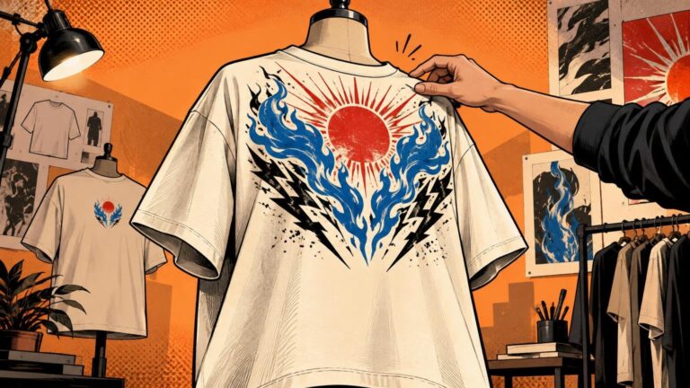
Oversized garments create another decision. Their extra fabric can make an ordinary print look timid, but filling every available inch is not always the answer. Use the silhouette and intended styling to decide whether the artwork should float or dominate. See our guide to sizing graphics on oversized T-shirts for that specific scale problem.
Decoration method can overrule the composition
Print and embroidery do not share identical limits. In Printful’s published guidance, both left-chest and center-chest embroidery are limited to 4 × 4 inches, while a 10 × 6-inch large-front option is available on applicable products. Moving embroidery from the left to the center therefore does not necessarily create a larger sewing field.
Shrinking stitched artwork is not equivalent to scaling down a printed image. Wilcom’s embroidery documentation notes that reducing a logo can require changes to stitch density and underlay to prevent bulk, while lettering below 5 mm needs special handling. If the art contains fine type or tightly packed details, simplify the design before choosing a smaller placement.
Make the decision with three mockups
Export the artwork at three plausible sizes and place each version on the same garment mockup: a compact left chest, a medium center chest and a full-front treatment. Then compare them at thumbnail size and at a realistic viewing scale.
- Choose left chest if the graphic remains recognizable when small and the shirt benefits from restraint.
- Choose center chest if one compact composition should command attention without covering the torso.
- Choose full front if detail, typography or dramatic scale is essential to the idea.
- Reject any option that depends on unreadably small type, crowds the neckline or looks balanced only inside the design file.
Finally, check the design on at least a small and a large garment template. Prepare the production file at its intended output size and follow the decorator’s product-specific requirements; general guidance cannot replace the actual print-area specification. The winning placement is the one that preserves the artwork’s hierarchy on the garment—not the one that merely uses the most space.
References
- T-shirt design placement guide: Sizes, tips & best spots | Printful
- T-SHIRTS /// DECORATION PLACEMENT
- What is Symmetry in UX Design? — updated 2026 | IxDF
- Unisex Jersey Short Sleeve Tee | Jersey T Shirt | Wholesale Blank T Shirts | Unisex Short Sleeve T Shirts | Bulk, Plain T Shirts | BELLA+CANVAS ®
- Examples of customized object properties