How to Design a Back Print That Works With a Small Front Graphic
The key to how to design a back print that works with a small front graphic is simple: do not make the front a miniature copy of the back. Give each side a different job. The front should identify, tease or frame the idea; the back should deliver the main image, statement or visual payoff.
A successful shirt reads as one system even though the two sides are not visible at the same time. That means the connection must be memorable rather than literal. Repeat one to three pieces of visual DNA—a symbol, typeface, color, border shape, texture or phrase—and let the scale and composition change around them.
How to design a back print that works with a small front graphic
Start by writing a one-line role for each side before arranging any artwork. For example: “The front is the maker’s mark; the back is the event poster.” That sentence prevents the chest graphic from accumulating too much information and stops the back from feeling like an unrelated second design.
A useful hierarchy looks like this:
- Front: a quick read at conversational distance.
- Back: the dominant image or message seen from farther away.
- Shared element: a recognizable cue that makes both sides feel related.
- Garment: the field that controls contrast, spacing and overall mood.
Hierarchy, contrast, repetition, alignment, proximity and negative space are standard tools for showing emphasis and relationships within a composition. The same logic applies across two sides of a shirt: repetition establishes the family resemblance, while contrast in scale makes the back feel decisively more important. The University of Wisconsin–Madison’s overview of contrast, repetition, alignment and proximity is a useful reference for these relationships.
Give the front a smaller job, not merely a smaller size
The small front graphic should survive a quick glance. If it needs a second line of fine print, a detailed illustration and three supporting marks to make sense, it is doing the back print’s job in cramped conditions.
Strong front roles include an icon, compact wordmark, short phrase, cropped detail, chapter number, fictional organization mark or small emblem. Each can introduce the world of the shirt without explaining all of it. A tiny moth on the chest might introduce a full nocturnal scene on the back. A two-word location mark might lead to a large tour-poster composition. A simple eye symbol could cue a back print built around surveillance typography.
Avoid shrinking the complete back artwork until it technically fits. Reduction changes more than dimensions: counters in letters close up, line spacing tightens, textures merge and secondary type loses authority. Printful similarly cautions that detailed artwork is less suitable for a small left-chest placement. If exact duplication is important to the concept, strip the front version down to its strongest silhouette or isolate one element from the larger composition.
Connect both sides with limited visual DNA
Matching everything can make the front feel like merchandise branding rather than part of a considered composition. Matching nothing makes the shirt feel assembled from two unrelated files. The useful middle ground is controlled repetition.
Choose one primary connection and, at most, two supporting connections:
- Typography: use the same type family, lettering logic or distinctive character shape.
- Motif: repeat one icon, character, object or geometric device.
- Color: carry one accent ink from front to back, even if the back uses a broader palette.
- Line treatment: repeat the same rough brush, clean vector edge, halftone or engraving style.
- Container: use related circles, shields, boxes, arches or framing lines.
- Language: split one phrase across the garment or use a short front label that names the longer back statement.
Do not repeat every device. If the front shares the back’s typeface, accent color, distressed texture, border and full phrase, it will probably feel over-specified. One obvious relationship plus one quiet relationship is usually enough.
Balance visual weight instead of matching dimensions
A small front mark and a large back image are supposed to be unequal. The design feels balanced when that inequality looks intentional. Visual weight comes from more than physical width: dark ink, high contrast, condensed bold type and dense shapes can make a compact chest mark feel louder than its measurements suggest.
Judge the front at the size it will actually be printed. A small solid badge may hold its presence next to an expansive line-art back print. A delicate outlined icon may need more size, a heavier stroke or stronger contrast to avoid disappearing. The goal is not equal impact on both sides; it is a clear opening note followed by a stronger second act.
Garment color is part of that equation, not a neutral preview background. A cream chest mark on black has immediate contrast, while a tonal dark-gray mark can behave more like a discovery. The back can use the opposite strategy. For a deeper look at that relationship, see how shirt color changes the way a graphic feels.
Four reliable front-and-back layout formulas
| Formula | Small front graphic | Large back print | Why it works |
|---|---|---|---|
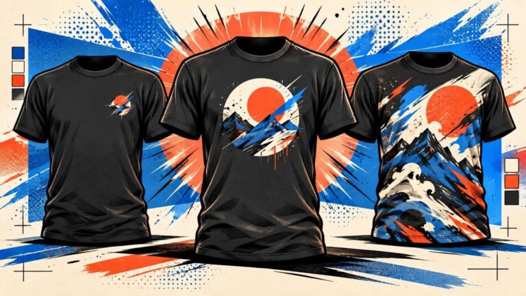
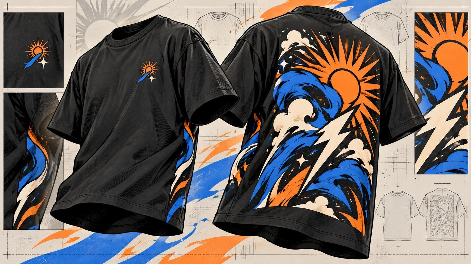
| Badge + Poster | Compact emblem or name | Image-led poster with headline and supporting text | The badge identifies the world; the poster expands it. |
| Detail + Whole Scene | One cropped object or character | Complete illustration or environment | The front creates curiosity without spoiling the full image. |
| Short Line + Full Statement | A few words or a chapter label | Longer phrase with stronger typographic hierarchy | The front sets the tone; the back carries the message. |
| Micro Mark + Oversized Type | Tiny icon or monogram | Large word or phrase spanning much of the upper back | The extreme scale change makes the shirt feel deliberate. |
These are frameworks, not templates. A punk graphic can use Badge + Poster with rough photocopy texture; a minimalist design can use the same formula with a single geometric emblem and generous empty space. The relationship matters more than the genre.
Choose left chest or centered front by reading the back
A left-chest mark usually feels like an identifier: uniform patch, maker’s mark, club emblem or understated brand cue. It also introduces useful asymmetry against a centered back print. A small centered-front graphic feels more declarative and formal. It establishes a stronger vertical axis, which can make a centered back design feel like the reverse side of the same composition.
Choose left chest when the front should whisper or when the back is already symmetrical and monumental. Choose centered front when the mark is typographic, when it needs to be read head-on, or when the entire concept depends on a front-to-back central axis.
There is no requirement to center the back merely because the front is centered. An intentionally offset back element can work, but it needs a visible reason: alignment with a seam, continuation of an asymmetric front cue or a composition built around deliberate imbalance. Arbitrary misalignment reads as a placement error.
Use dimensions as starting points, not laws
Printful presents approximately 2.5 × 2.5 to 5 × 5 inches as a common starting range for left-chest artwork, with a reference placement around 3 inches below the neckline and 2 inches from the armpit. Its guide describes common full-back areas around 10 × 12 to 12 × 16 inches. These are orientation ranges, not universal production specifications; printable areas vary with the garment and production setup.
More importantly, the same measurements do not create the same result on every blank. An oversized shirt provides a broader field and can make a conventional back print look cautious. A cropped shirt shortens the available vertical composition. Youth, tall and extended sizes alter the relationship among collar, shoulders, side seams and hem. Consult the exact garment template rather than scaling from a generic T-shirt outline. For deliberately roomy silhouettes, graphic sizing on oversized T-shirts requires its own proportional judgment.
Leave enough space around the back graphic for it to look composed rather than trapped between collar and seams. There is no single correct margin. Dense rectangular artwork often benefits from visibly calm space around its edges, while a loose illustration can extend farther because its irregular silhouette already creates internal breathing room.
Review the shirt as an object, not two artboards
Front and back files viewed separately can both look polished while producing a confused shirt. Put them on front-and-back mockups of the same garment, at the same apparent scale, and compare them side by side. Then inspect a three-quarter view if one is available. That view reveals whether the front mark and back composition feel like parts of one object.
Check the design at three distances. Up close, the small mark should retain clean shapes and readable type. At conversational distance, its main symbol or phrase should register without effort. From farther away, the back should own the silhouette and present one dominant read before its smaller details appear.
This is also where a design that looks excellent on screen can fail on fabric. The garment bends around shoulders, hangs away from the lower back and changes proportions across sizes. Evaluate the blank as part of the composition, following the same garment-first logic used to assess whether a T-shirt graphic actually looks good when worn.
Run a production reality check
Before final approval, ask the printer for the artwork requirements tied to the chosen garment and decoration method. Fine lines, tiny type, gradients, ink coverage and color behavior cannot be judged from a universal threshold because screen printing, direct-to-garment, direct-to-film transfers and other processes impose different constraints.
If the project expands from composition into supplier or method selection, treat custom printing as a separate decision from the visual concept. A strong front-and-back system still needs to be translated into the specifications of the selected process.
- Confirm the printable area for the exact garment, size range and decoration method.
- Print the chest artwork at physical size on paper; do not approve it only while zoomed in.
- Check that small counters, gaps and linework remain distinct at intended size.
- Confirm collar, shoulder, side-seam and hem clearance with the printer’s template.
- Compare the lightest and darkest garment sizes or colors included in the run.
- Verify that the front and back use consistent color values where a visual match is intended.
- Inspect a sample when the run size, artwork complexity or garment variation makes placement risk significant.
Make the relationship obvious in one sentence
The best final test is verbal. Complete this sentence: “The front introduces _, and the back reveals _.” If both blanks receive the same answer, the front is probably redundant. If the answers have no relationship, the two graphics need a stronger shared cue.
Design the front first as a concise signal, then build the back as the payoff. Repeat only enough visual DNA to establish continuity, use scale to create hierarchy and review both sides on the actual garment template. That is what turns a chest hit and a back print into one shirt rather than two graphics competing for the same fabric.