
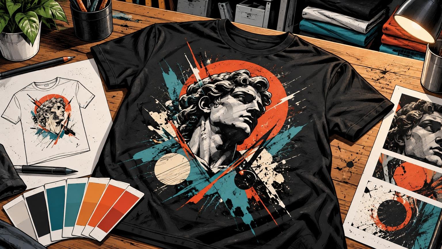
Graphic Tee Design, Shirt Art and Style
Explore typography, placement, scale, color, and composition choices that make graphic tees feel intentional, current, and wearable.
Design for the Garment, Not the Canvas
Graphic tee design succeeds when the artwork treats the shirt as part of the composition, not as empty space beneath a finished image. Defiant Shirts looks at the decisions that create that difference: hierarchy, silhouette, contrast, rhythm, placement, scale, and the relationship between ink and garment color. The goal is simple: make the graphic feel intentional the moment someone puts it on. Every element should earn its place on the fabric.
Here, the garment is not a neutral background. Its proportions, movement, and negative space set the terms of the design. A graphic can look balanced inside a neat digital rectangle and lose its force on a moving body. This publication covers how artwork changes when it crosses seams, sits high or low on the chest, expands across an oversized fit, or competes with folds and fabric color.
Typography is judged by voice and readability. Composition is judged by what attracts the eye first, what supports it, and what disappears at a normal viewing distance. The focus stays on choices designers, illustrators, apparel creators, streetwear fans, and people developing graphic tees can use. That means deciding whether a type-led design needs an image, whether texture adds character or noise, and whether a bold full-front print has enough structure to hold its size.
Latest from Defiant Shirts
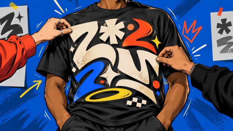
How to Make Typography Work as the Main T-Shirt Design
Strong typographic T-shirts treat words as shapes, build an obvious reading order and compose around the moving garment rather than a flat screen.
Read more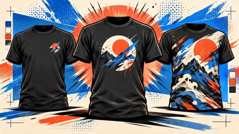
Center Chest vs Left Chest vs Full Front: Choosing a Shirt Print Placement
Choose left chest for a restrained signature, center chest for a focused graphic, or full front when the artwork needs scale, detail and visual dominance.
Read more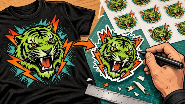
Preparing a T-Shirt Graphic for Custom Sticker Printing
Turn an existing T-shirt graphic into a print-ready sticker by simplifying small details, choosing an edge treatment and reviewing the cutline at actual size.
Read moreMake Every Choice Pull Together
Strong shirt art is rarely about adding one more effect. It is about making the important choices agree. A compact mark needs a different visual logic from a wide back print. A distressed illustration needs typography that shares its era and energy. A limited palette must create separation through value, shape, or negative space. Defiant Shirts examines those relationships so readers can identify the choice that strengthens a concept and the choice that merely fills space.
Start with the design problem that is most visible on the garment. If the artwork feels timid, examine scale and placement before redrawing it. If the message feels generic, inspect the typography and aesthetic references. If the graphic becomes muddy against the blank, return to color and composition. The best next move is usually not a total restart; it is a more deliberate decision about what the viewer should notice first, what should support it, and what can be removed.
Frequently Asked Questions
What does Defiant Shirts cover?
Defiant Shirts covers graphic design, typography, placement and scale, style and aesthetics, and color and composition for graphic tees.
Who is this publication for?
It is for designers, apparel creators, streetwear fans, illustrators, and anyone developing graphic tees.
Where should I start when a shirt graphic feels wrong?
Identify the clearest problem first: weak presence, unclear hierarchy, mismatched style, poor readability, or insufficient contrast. Then browse the category that addresses that decision.