How to Make Typography Work as the Main T-Shirt Design
Strong typographic T-shirts treat words as shapes, build an obvious reading order and compose around the moving garment rather than a flat screen.

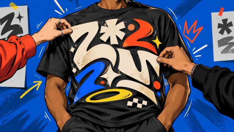
Strong typographic T-shirts treat words as shapes, build an obvious reading order and compose around the moving garment rather than a flat screen.
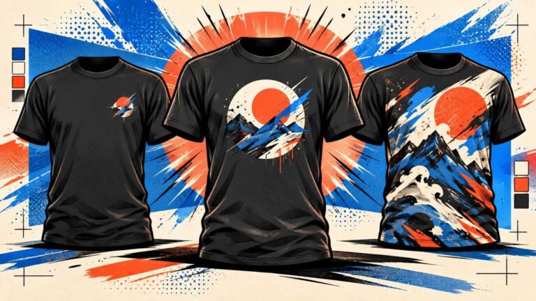
Choose left chest for a restrained signature, center chest for a focused graphic, or full front when the artwork needs scale, detail and visual dominance.
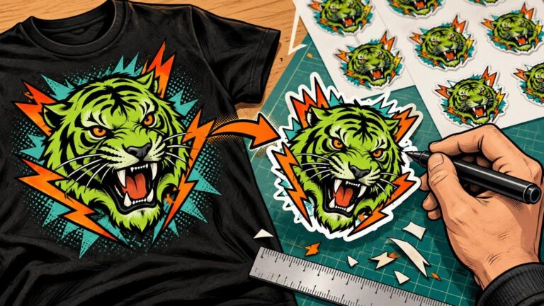
Turn an existing T-shirt graphic into a print-ready sticker by simplifying small details, choosing an edge treatment and reviewing the cutline at actual size.
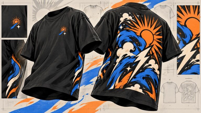
Give the small front graphic and large back print different jobs, then connect them through a few deliberate visual choices. This guide explains hierarchy, scale, placement and pre-production checks.
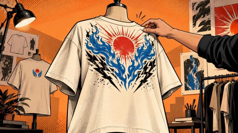
Start with a 12–14-inch-wide front graphic on most adult oversized tees, then refine its scale and placement against the exact garment and production template.
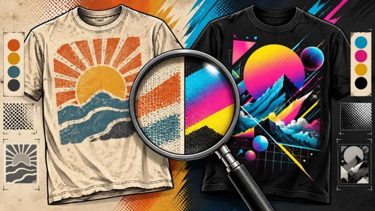
Vintage T-shirt graphics feel different because their palettes, typography, image treatment and composition follow a coherent print logic—not simply because they look distressed.
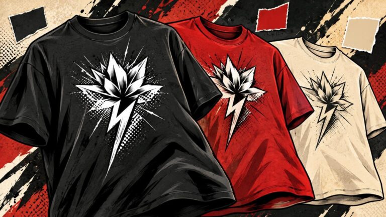
The blank is the graphic’s largest color field. Learn how garment color changes contrast, character, print behavior and wearability before you approve a design.
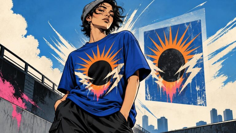
A strong T-shirt graphic treats the garment as part of the composition. Use these practical checks to improve hierarchy, scale, placement, contrast, and readability.