
Why Vintage T-Shirt Graphics Look Different From Modern Designs
TLDR: Vintage T-shirt graphics usually look different because they were conceived around garment printing, limited color relationships, bold separations and fast readability. Age can add fading or cracking, but the convincing “vintage” character begins with composition and print logic. Build the image to work on fabric first; add distress only if it supports that structure.
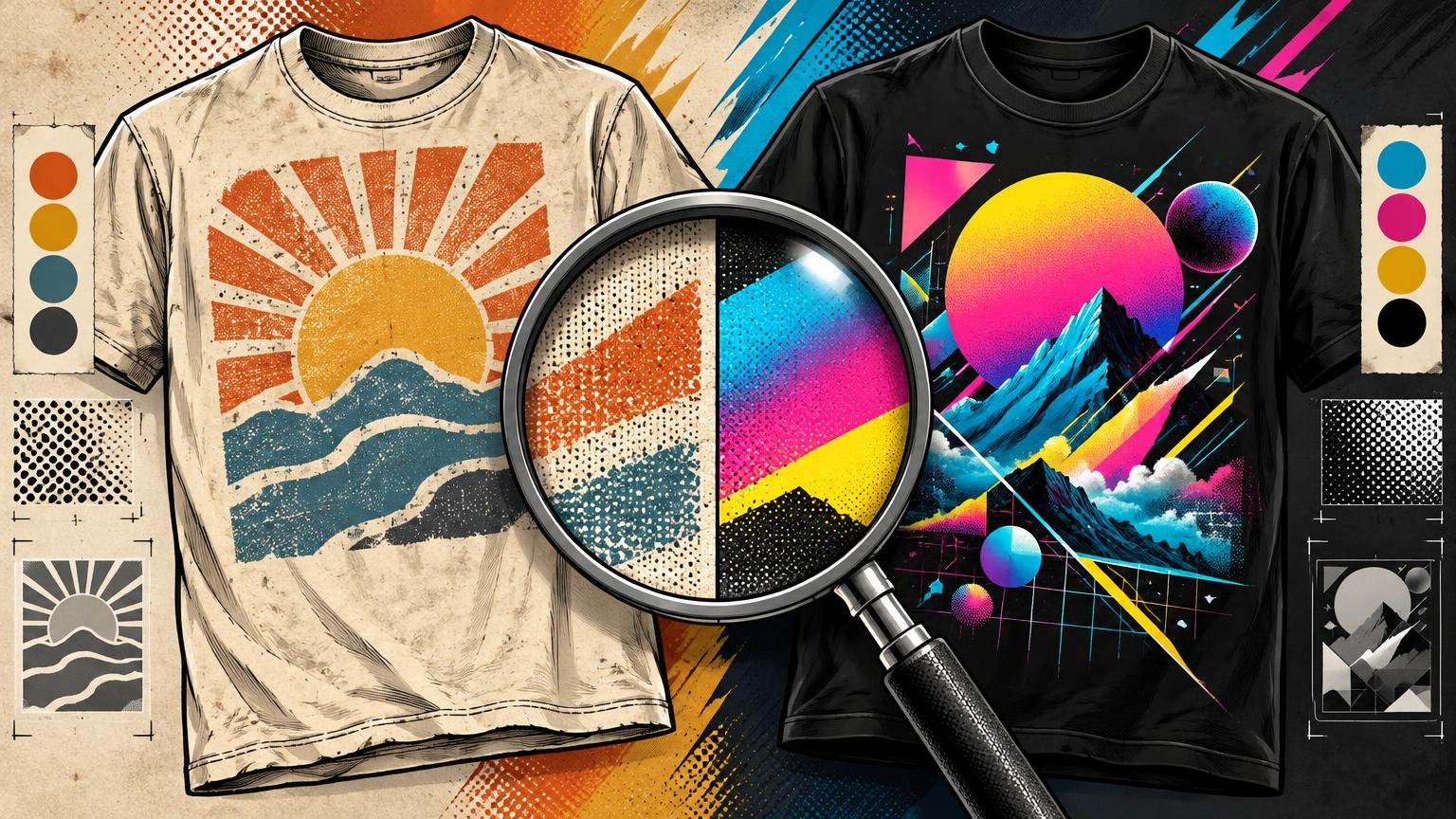
The clearest answer to why vintage t-shirt graphics look different from modern designs is not “old ink.” It is that many older graphics carry visible evidence of how they were designed to be printed and worn. They reduce photographs into dots or shapes, let the shirt supply part of the palette, favor assertive lettering and organize the image around what survives movement, folds and distance.
Modern graphics can follow that same logic, but they do not have to. Current digital workflows can accommodate highly detailed imagery, broad color variation and polished tonal transitions. That freedom is useful, yet it can also encourage a design that looks impressive as a large screen image and turns visually indecisive once it becomes a chest print.
“Vintage” is not one visual style
A 1970s protest shirt, an 1980s tourist souvenir and a 1990s band tee do not share one universal formula. Museums Victoria describes printed T-shirts of the 1960s and 1970s as vehicles for youth culture, protest and personal expression, helped by text and images that could be screen printed readily. Its overview of T-shirts in social and material history is useful context for understanding why direct slogans and emblematic images became so important.
Even museum dating shows how broad the category can be. The Metropolitan Museum of Art lists one cotton T-shirt as dating somewhere from 1970 to 1989—a range that spans substantial shifts in music, fashion and graphic language. “Vintage,” then, describes age or an association with earlier periods; it does not specify one palette, typeface or printing method.
The practical lesson is to choose a reference period and visual culture before choosing effects. “Late-1970s community event shirt” is a usable direction. “Make it vintage” is not. The narrower reference tells you whether the design should feel handmade, athletic, psychedelic, institutional, commercial or connected to a music scene.
Why vintage T-shirt graphics look different at the production level
Screen printing often builds an image from separate areas of ink. A flat spot color can create a solid shape; multiple separations can combine into an illustration; halftone dots can make one ink appear to produce lighter and darker tonal areas. Technical guidance from Printing Industries of America distinguishes simpler spot-color work from process approaches built from color-separated halftones, with detailed process printing demanding tighter production control. Its overview of garment-printing techniques explains that production foundation.
Those mechanics affect the drawing. An illustrator working toward separations has a reason to simplify shadows, strengthen contours and decide which details deserve their own ink color. The result often feels abbreviated but deliberate. A cheek may become one shadow shape. A sunset may become three bands. A photograph may become a field of visible dots rather than a seamless tonal image.
Halftones also carry technical baggage. Dot patterns, screen angles and the interaction among separations can produce moiré, an unwanted interference pattern, if they are not controlled appropriately. That is why authentic-looking dots should not be treated as random decoration. Their scale and arrangement belong to a reproducible image system.
None of this means every old shirt used few inks or every modern shirt uses unrestricted color. It means that visible separation logic is one major reason older-inspired work reads differently. The graphic shows how it has been translated into print.
The shirt supplies part of the image
A screen has a fixed, illuminated rectangle. A shirt has a base color, changing contours and a wearer inside it. Vintage-informed graphics often accept that condition instead of trying to overpower it. Open areas let the garment show through, turning the blank into a major color field rather than treating it as empty space.
That makes garment choice a design decision. Cream fabric can soften a hard black-and-red illustration. Faded black can make pale inks feel atmospheric. A saturated shirt may compete with a multicolor image but strengthen a restrained one. Before choosing inks, consider how shirt color changes the way a graphic feels.
Negative space also helps the print bend with the body. A graphic made from several connected forms can remain readable as the torso turns. A dense rectangular image may behave more like a poster pasted onto the chest. That rectangle can be intentional, especially in modern streetwear, but it creates a different relationship between graphic and garment.
Vintage composition favors recognition before inspection
A strong shirt graphic needs a dominant read: the face, mascot, phrase, symbol or silhouette that registers first. Secondary details can reward a closer look, but they should not compete equally for attention. This hierarchy matters because shirts are usually encountered on moving people rather than studied as flat artwork.
Older-inspired designs often achieve that hierarchy through a few forceful decisions:
- One dominant image or phrase controls the composition.
- Large value differences keep the subject visible against the garment.
- Letterforms use enough weight and spacing to survive printing, fabric texture and normal viewing distance.
- Secondary copy follows a clear role, such as a date, location, tour stop or organization name.
- Open fabric areas separate important shapes and prevent the design from becoming one undifferentiated block.
Modern screen-first work can reverse those priorities. It may rely on tiny text, subtle gradients, low-contrast texture and multiple equally detailed focal points. Those choices can look refined in a close-up mockup. On a body, they may collapse into visual noise. For a broader evaluation of hierarchy, placement and scale, use the checks in what makes a T-shirt graphic look good when worn.
Distressing is evidence only when the structure supports it
Cracks, faded areas and missing flecks can result from wear, laundering, the original print, deliberate contemporary styling, reproduction quality or even the photograph of the shirt. A distressed image is therefore not proof that a design is old. Nor does a distress mask automatically make new artwork feel historically grounded.
The common mistake is to finish a polished digital composition and place one uniform grunge texture over everything. The texture may say “damaged,” but the underlying image still says “designed as a clean screen graphic.” Its gradients, typography, edge quality and color relationships remain unchanged.
A more convincing order is to establish the period reference, silhouette, palette, separations and type first. Then decide whether surface wear belongs. Distress should vary with the forms beneath it rather than erasing every part equally. Keep critical facial features, letter counters and thin strokes readable. If removing the texture destroys the vintage character, the underlying art direction probably needs more work.
Vintage-informed and modern-polished are different tools
| Design choice | Vintage-informed approach | Modern-polished approach |
|---|---|---|
| Palette | A small set of strongly related colors, often using the garment as another color | Broad color range and smoother tonal transitions |
| Image treatment | Flat shapes, line work, duotones or visible halftones | Continuous-tone photography, fine gradients or highly rendered illustration |
| Typography | Bold display type integrated with the image | Type may be cleaner, smaller or separated from the main image |
| Edges | Print-aware shapes that may tolerate slight variation | Crisp edges and precise digital detail |
| Texture | Fabric, ink behavior and selective wear remain visible | Surface can appear smooth, dense and controlled |
| Primary risk | Becoming a costume through excessive fake aging | Becoming a screen composition that loses impact on the body |
Neither column is inherently better. A glossy cyber image may need immaculate gradients. A garage-band graphic may benefit from rough separation and an abrasive photocopied rhythm. The problem begins when the visual idea and production language disagree.
Current workflows expand the available choices. Epson, for example, markets hybrid direct-to-garment and direct-to-film equipment around detailed imagery, vivid color and white-ink opacity across different garments. Those are manufacturer claims about its equipment, not a universal verdict on every print workflow. The relevant creative point is that designers can now retain detail that might previously have been simplified. Capability, however, is not obligation. More printable detail does not automatically create a stronger shirt.
How to build a vintage-informed graphic that works on a shirt
1. Define the reference more narrowly
Name a period, scene and object type. A county-fair souvenir, political campaign shirt, motorcycle graphic and arena-tour tee solve different visual problems. Collect references for composition, lettering and image treatment—not just examples of cracked ink.
2. Find the one-second read
Shrink the graphic or step away from it. What remains? If the answer is “a cluster of equally important details,” choose a leader. Strengthen one face, phrase or silhouette and make everything else support it.
3. Reduce the image before adding texture
Try the artwork as flat shapes, line art, a duotone or a controlled halftone treatment. Decide which tonal changes carry meaning. A highlight that defines a face deserves protection; a subtle background gradient may not deserve another layer of complexity.
4. Test the actual garment color
Do not evaluate the art only on a white digital canvas. Place it on the intended garment color and check the lightest and darkest areas. Ask whether open fabric can replace an ink color and whether the blank strengthens or weakens the mood.
5. Review the design at intended print size
A zoomed-in file hides weak type and fragile details. Mock up the real chest scale, then inspect the design at a normal on-body viewing size. Remove details that disappear before adding deliberate wear. This is also the point to check whether the composition feels integrated or merely centered on the shirt.
6. Discuss print behavior, not just file delivery
Tell the printer the garment color, intended ink feel, important halftones and whether apparent irregularities are deliberate. Ask how the artwork should be separated, whether the chosen garment requires a base layer beneath certain colors, and which fine details are vulnerable in the proposed process. Keep that production conversation distinct from the broader custom-printing decision: the artwork should already have a clear visual hierarchy before process options multiply.
- Which color is the garment contributing to the composition?
- Are visible dots functional halftones or merely a texture effect?
- Which edges must stay crisp, and which can tolerate variation?
- What is the smallest essential type at final size?
- Should the print feel solid and graphic, or soft and integrated with the fabric?
- Does any simulated misregistration improve the image, or simply imitate a production error?
The next step is subtraction, not distressing
Start by placing the design at its intended chest size on the actual garment color. Identify the first thing a viewer sees, then remove or strengthen every element that competes with that reading. Reduce weak colors, enlarge vulnerable type and simplify details that disappear.
Only after the graphic works cleanly should you consider coarse dots, faded areas, rough edges or apparent misregistration. Vintage T-shirt graphics feel convincing when composition, type, palette and print treatment tell the same story. The surface wear is the final accent—not the source of the style.