
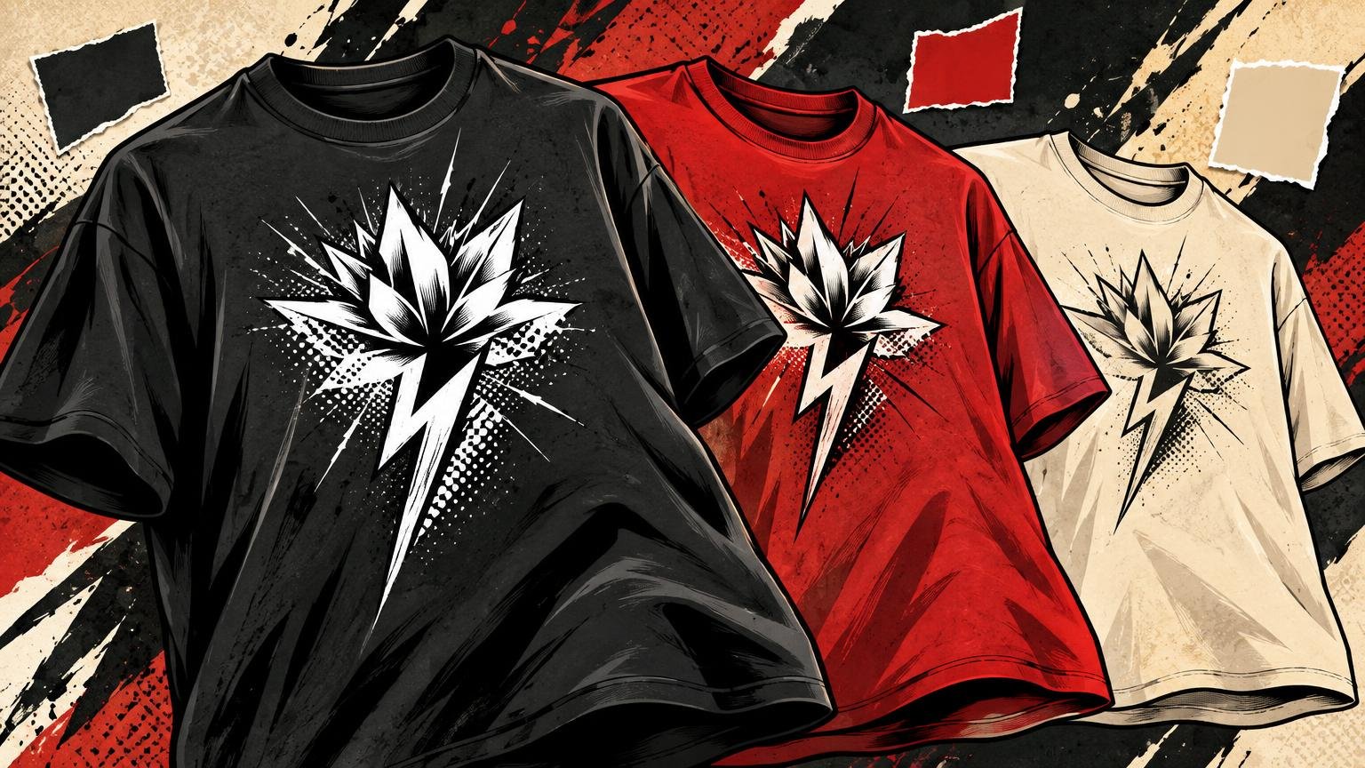
How Shirt Color Changes the Way a Graphic Feels
TLDR: The blank is not a neutral background. It is the largest color field in the composition, so it controls contrast, shifts the apparent mood of the artwork and affects how printed colors appear. Understanding how shirt color changes the way a graphic feels starts with one decision: should the design pop, blend, soften, age or dominate the outfit? Make two or three garment-color mockups, inspect them at realistic size and then sample the actual blank with the intended print process.
A graphic can look electric on black, relaxed on cream and unexpectedly corporate on bright white without changing a single pixel. That is how shirt color changes the way a graphic feels: the eye reads the garment and artwork together. On a screen, the canvas ends at the artboard. On a body, the graphic sits inside a much larger field of fabric, interrupted by folds, sleeves, shadows and movement.
The best color is therefore not the shade with the most fashionable name. It is the one that gives the graphic the intended hierarchy while remaining wearable. Before choosing it, decide what the shirt should do from across a room: announce a message, reward a closer look, anchor an outfit or feel as though the image has always belonged to the fabric.
Start with the intended relationship between shirt and graphic
Treat the garment color as an active design element. It can behave as empty space around the image, become one of the image’s colors or compete with every printed mark. That relationship matters more than an isolated idea such as “black is edgy” or “blue is calm.”
- Choose high separation when a slogan, small type or intricate line needs to register quickly.
- Choose a tonal relationship when you want the shirt to feel quiet, polished or discovered gradually.
- Use the fabric as an unprinted color inside the illustration when you want the artwork and garment to feel integrated.
- Choose a vivid blank only when its intensity has a job in the composition. A loud ground can energize simple art but overwhelm a palette that is already busy.
- Choose a softened neutral when the concept depends on age, tactility, nostalgia or everyday wearability.
This is also why a well-drawn image can still feel like a sticker. If its palette, edge treatment and negative space ignore the surrounding fabric, the artwork remains a rectangular screen composition transplanted onto clothing. A successful tee usually lets the garment participate, whether through open negative space, shared hues or deliberate contrast. That principle is central to judging what makes a T-shirt graphic look good when worn.
Contrast changes how quickly the design reads
Value contrast—the difference between light and dark—is usually the first practical check. Pale art on a dark shirt or dark art on a light shirt establishes a clear figure-ground relationship. This helps typography, faces, symbols and fine details separate from the garment at a glance.
The W3C’s explanation of contrast and perceivability concerns digital text rather than apparel, so its numerical requirements are not shirt-printing rules. The broader visual principle is still useful: reduced contrast makes information harder to distinguish, particularly for viewers with reduced contrast sensitivity. On a shirt, distance, motion, fabric folds and uneven lighting add more reasons not to rely on a fragile color difference for essential lettering.
High contrast is not automatically better design. A huge geometric mark can survive as charcoal ink on a black tee because its scale and simple silhouette do the work. Tiny condensed lettering in those same colors may disappear. Tonal printing works best when the mark is broad, the hierarchy is uncomplicated and subtlety is the point rather than an accident.
Test the weakest part, not the strongest
When comparing shirt colors, look first at the element most likely to fail: the smallest type, thinnest line, darkest shadow or palest highlight. The hero illustration may remain convincing across five blanks while the supporting date, location or caption becomes unreadable on three of them. A colorway succeeds only if the information that matters survives.
How common shirt colors redirect the same artwork
Color associations are contextual, not fixed emotional commands. A systematic review covering 128 years of research found a substantial but complex body of work linking colors and emotions, while research from Southern Cross University identifies perceptual, conceptual, spatial and sociocultural context as relevant to those associations. In other words, do not expect a red shirt to produce one universal feeling. Read it alongside the subject, palette, typography, audience and styling context.
| Shirt-color direction | What it tends to do visually | Useful starting point |
|---|---|---|
| Black or very dark | Frames light and saturated art sharply; can make open areas feel deeper and more dramatic | Bright illustration, concert-style art, bold white typography |
| White | Creates maximum visual air but can make hard-edged artwork feel especially clean or graphic | Editorial linework, dark type, colorful art with deliberate white space |
| Natural or cream | Softens the ground and reduces the clinical snap of pure white | Vintage references, muted palettes, botanical or souvenir-style art |
| Heather gray | Introduces visible texture and a casual middle value that can reduce crisp separation | Athletic references, distressed art, simple dark marks |
| Earth tone | Acts as an environmental color rather than empty space | Nature imagery, workwear cues, restrained warm palettes |
| Vivid color | Becomes an assertive part of the image and can energize minimal artwork | One- or two-color marks, playful type, intentionally loud graphics |
| Near-tonal neutral | Makes the design emerge slowly instead of announcing itself | Oversized symbols, minimal branding, low-key fashion graphics |
These are design directions, not rules. Black can make bright art look spectacular, but it can also make a multicolor image feel harsher than intended. Cream can support a nostalgic illustration, yet it may muddy pale yellow details. Heather texture can complement distressed lettering while making delicate linework feel less precise. Judge the interaction, not the blank in isolation.
The garment color can change the physical print
A mockup shows a color relationship; it does not fully predict a printed object. Avient notes that monitor color and printed color can differ, and identifies reflected light, ink opacity, garment color and white underbases among the factors affecting printed appearance. Fabric is reflective, textured and flexible, so the result is not equivalent to placing a digital layer over a flat RGB background.
On a dark garment, a white underbase may be used beneath colored ink so the fabric does not influence those colors as strongly. That can help preserve brightness, but it also changes the physical construction of the print. The exact result depends on the ink system, artwork and production method. This is where an aesthetic decision becomes a production conversation; a general print-production specialist can help clarify available methods, but the relevant printer still needs to evaluate the actual artwork and garment.
The key design consequence is simple: do not approve a dark-shirt colorway merely because its mockup glows. Ask how the light colors will be built, whether the garment is intended to show through and what level of opacity suits the concept. A faded souvenir graphic and a sharp neon illustration may need opposite treatments even when both appear on black.
Match the color choice to the graphic’s job
| Graphic goal | Promising shirt direction | What to verify |
|---|---|---|
| Fast-read slogan | Strong light-dark separation | Smallest letters remain distinct at several steps away |
| Vintage or souvenir character | Cream, faded neutral, heather or softened color | Distressing and low-contrast details still look intentional |
| Nature illustration | Natural, earth tone or a dark environmental hue | Greens and browns remain separated from the ground |
| Bright maximalist art | Black, white or a controlled neutral | The blank supports the palette instead of adding another competing accent |
| Minimal tonal mark | Neighboring dark or light values | The silhouette remains recognizable in folds and indoor light |
| Detailed illustration with small type | A ground that separates both highlights and shadows | Fine lines, captions and edge details survive production |
Notice that the recommended direction changes with the job. If typography carries the message, readability deserves priority. If the design is a large atmospheric illustration, integrating the fabric may matter more than preserving every screen color. If the tee is meant to anchor everyday outfits, a versatile neutral may produce a better object even when a vivid blank wins the isolated mockup comparison.
Check wearability, not just the artboard
A shirt lives among skin tones, trousers, jackets, jewelry and changing light. It bends around the chest and breaks at the waist. A colorway that looks balanced as a square product image may become visually top-heavy when worn, especially if the blank is bright and the print occupies a dense central block.
Use a practical wearability pass before approval:
- View the design at approximately the size it will appear on the garment rather than continuously zooming in.
- Reduce the mockup until it resembles a person seen from several steps away. Check what reads first.
- Place the art on a full-shirt view so the sleeves, collar and surrounding fabric influence the composition.
- Compare it under bright and dim viewing conditions. Do not rely on a perfectly illuminated display.
- Imagine common pairings. Decide whether the shirt should lead the outfit or cooperate with it.
- Add a few realistic folds or inspect a photographed sample. Make sure the essential message does not depend on one uninterrupted flat area.
This pass often reveals the real decision. A loud orange blank may make the artwork more exciting but limit how easily the finished tee enters an outfit. A charcoal blank may lower the graphic’s immediate impact yet make it the shirt someone reaches for repeatedly. Neither outcome is inherently superior; the design brief should decide.
Use a three-stage color test before committing
Start with three mockups, not twenty. One should maximize contrast, one should integrate the graphic with the garment and one should explore a more distinctive color. Keeping the field small makes the tradeoffs visible instead of turning the exercise into a blank-color catalog.
- State the intended effect in a sentence, such as “read instantly,” “feel sun-faded” or “look quiet until viewed closely.”
- Compare value contrast first. Temporarily view the options in grayscale if hue is distracting you from weak light-dark separation.
- Inspect the most vulnerable details at realistic size and distance.
- Review the whole garment and likely outfit context, not only a cropped chest graphic.
- Confirm how the printer plans to handle opacity, underbases and the selected garment color.
- Approve a sample made on the actual blank with the intended process. Inspect it in ordinary indoor and outdoor light before committing to a larger run.
If the sample differs from the mockup, that does not necessarily mean the printing failed. The display, fabric, reflected light, ink construction and garment ground are different systems. Use the sample to decide whether the physical result fulfills the original intention, not whether it perfectly imitates a glowing screen.
Choose the feeling, then prove it on fabric
Shirt color changes more than the background. It determines how quickly the image reads, how separate or integrated it feels, how assertively it enters an outfit and how the printed colors may appear. The right choice begins with a verb: pop, blend, soften, age, anchor or shout.
Build one contrast-led mockup, one integrated mockup and one wildcard. Eliminate any option that loses essential information, then sample the strongest direction on the real garment. That final physical check is what turns a convincing screen composition into a graphic that actually belongs on a shirt.
References
- Understanding Success Criterion 1.4.3: Contrast (Minimum) | WAI | W3C
- Do we feel colours? A systematic review of 128 years of psychological research linking colours and emotions | Psychonomic Bulletin & Review | Springer Nature Link
- The effect of perceptual, conceptual, spatial, and sociocultural context on colour-emotion associations – Southern Cross University
- Color Theory – From Monitor to Print | Avient